Mona
Fashion Clothing Online Store
Tasks
We had a task to make a fashion website. A site that should be impeccable, not only from the technical side, but also from the design side. Moreover, the audience of the site has an exceptional taste, which means that the standards were the highest.
Technical requirements for project:
Collection selection
It was decided to make the display of the collections in the form of a tile dividing it with fairly wide white spaces. The menu we "packed" in the left side and hid. The menu is revealed in all its glory only on hover. This provided a general perception of this concept as a booklet of a fashion house. It was this allusion that we sought.
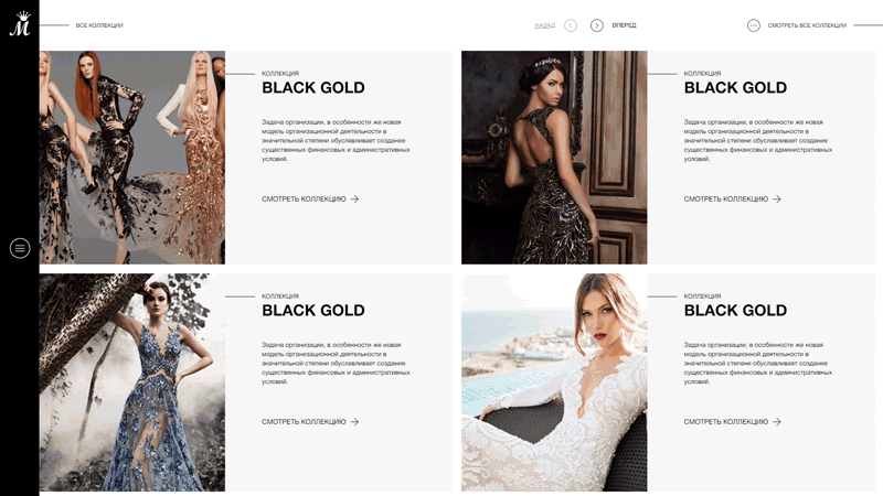
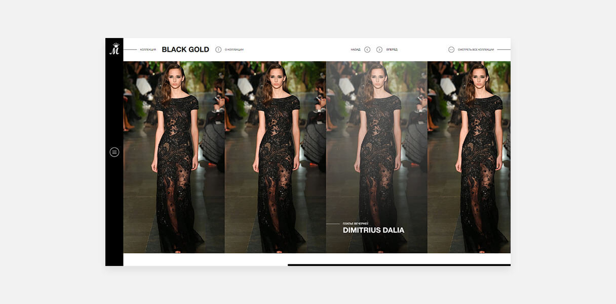
Gallery Collection
Photos and the collection are reflected in the form of bookmarks that are activated and display additional information on hover. This provided the next level of association, this time with the magazine.
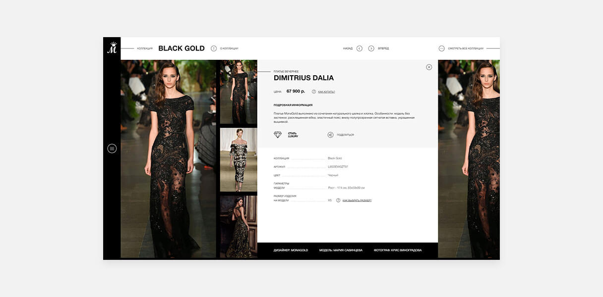
Card Product
The product page should continue to convey the idea of the designer to the visitor as simple as possible, while providing him with all the necessary information. Behind a simple at first glance format, there are many details that create the style.
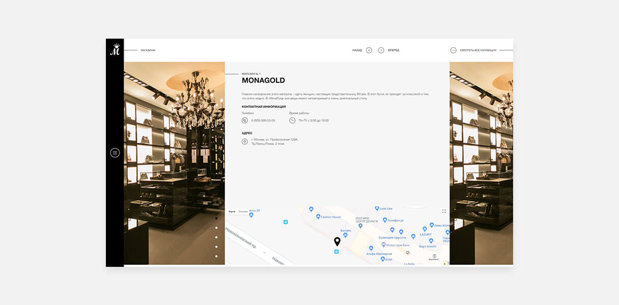
Contact Page
Contact information should give a clear idea of how to contact us. This page gives this fully with the help of text and an interactive map + to this by putting a photo of our boutique with a background on both sides, we give the user an understanding of the level of the company.
Article
Photos and videos are the most important in the fashion industry, but revealing a complex topic without text is impossible. In this section you can read news, articles and important tips from the life of fashion.
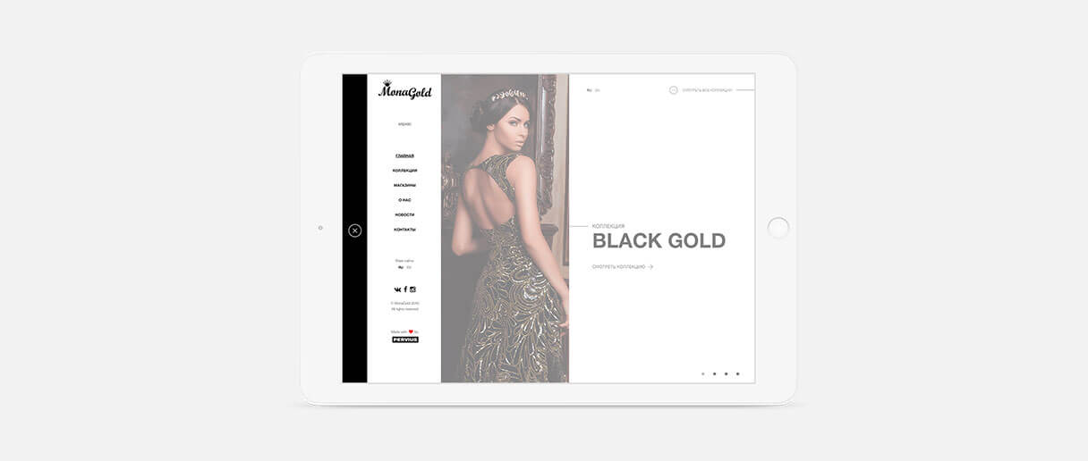
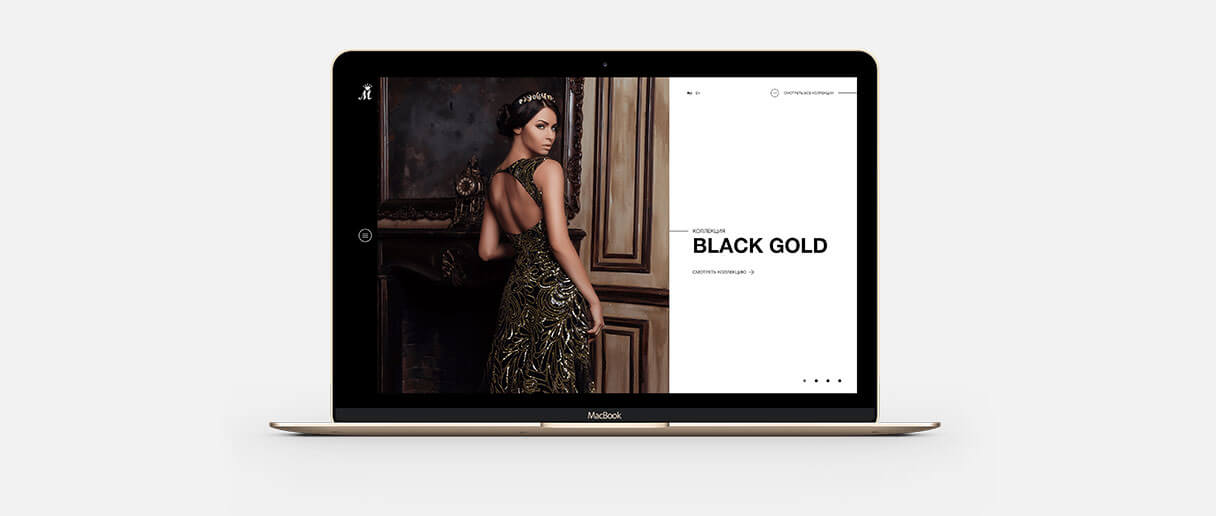
Adaptive layout
Which is already the standard for modern sites. The user should conveniently interact with the site regardless of the device that he uses, whether it is a phone, laptop or tablet.